Fun with maps
Cartogram of the 2004 election using red/blue color scaling and county populations:

World spending on healthcare:
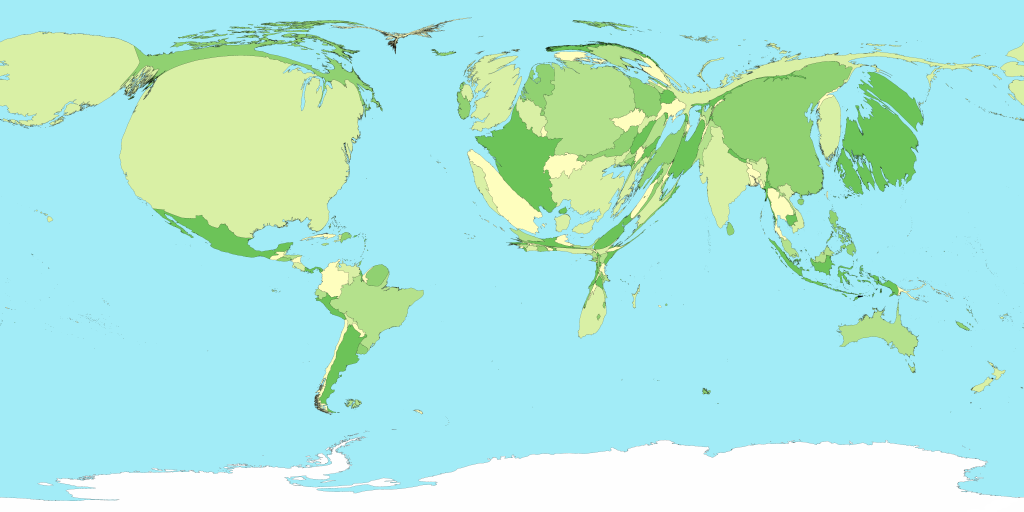
It's interesting to note that the maps for healthcare, energy use, and greenhouse gas emissions are almost identical.
World spending on healthcare:
It's interesting to note that the maps for healthcare, energy use, and greenhouse gas emissions are almost identical.
posted by gatb42 at 10:09 PM
![]()


0 Comments:
Post a Comment
<< Home